The Wrong Side of my Car
The blog that wants to go obsolete
Is cycling still for the rich?
Here are 2 somewhat related statements that sow division among urbanists:
- The car is the vehicle of the poor
- Cycling is for rich people
If you see these coming up you can expect mockery. However, we have census data and the so-called deprivation index, so we can actually check this. Last time we saw little evidence that either of them is wrong.
Did anything change with the 2018 census?
The data
The first part is the census data which we covered earlier with the maps. The second part is the New Zealand Index of Socioeconomic Deprivation for Individuals (NZiDep) *1 The data is cropped to the same area as the maps.
This index gives us a proxy to tell which areas probably are more or less affluent.
Mode shares: travel to work
I ordered the X axis differently this time: area units are simply sorted by NZDep score and positioned by cumulative population. The striping shows which dots are part of which index. The plotted lines show quantiles within each NZiDep.
A notable change to the data is that the CBD is now split into more than 2 SH2 units, so we can no longer easily recognise it. It tended to be a bit of an outlier, being both central and not super well-off.
Work from home
This one should surprise no-one:

Cars: the vehicle of the poor
That is probably a bit exaggerated, but still, it does slightly increase to the right.

This should be surprising, but for anyone living in Auckland for any length of time it isn’t.
Cycling for the rich
Bicycles are cheap, right? But it is not reflected in the data.

Again, this should be surprising, but again, for anyone living in Auckland for any length of time it isn’t. Especially the high mode shares are heavily skewed towards affluent areas, a point which is now being picked up by cycling advocates.
Did you notice the median is below 1% for all indices? Or did you notice the areas sitting at exactly 0%? These represent areas, some of them with well over a thousand responses, where not a single person responded that he cycles to work.
The gap above this line is quantisation error (the census reports quanta of 3 responses).
Walking

There are a few central areas with a high walk mode share. The bulge probably just tells you what sort of NZiDep scores you find in central areas.
Let’s zoom in on the bottom:

Well, that is what, 2% across the board?
Together with bicycling, we have 3 to 4% so-called active mode shares, that is astoundingly low.
Public Transport
Some say buses are for the poor, however it seems more a middle class thing.

Response rate
How many people responded to these questions anyway? Let’s have a look.

Note the drop for travel to work responses at higher NZiDep.
Mode shares: travel to education
The census now also asked students this question, so let’s have a look. And with students we mean everyone who is in school, from Kindergartens and Early Childhood Education, to Universities *2.
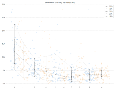
School bus
School buses are buses reserved for school kids. (You can recognise them by their line number starting with a zero). *3

Well, they’re clearly not cheap.
Study at home

That is a bit more uniform than work at home. Although it still drops off at the right.
Car
Some say this figure is over 50% even for primary school kids. A figure which is unthinkable in Europe.

Cycling
Roughly the same shape here as the people going to work, but on a map you will see this is very concentrated around a few schools.

There are a few areas with over 10% mode share. All these areas have NZiDep 1 to 4. The rest of the graph is also more skewed towards low NZiDep than its cycle to work counterpart. So it is quite likely that the cycling student is significantly better off than average.
Walking
Walking is much more popular with students than with workers, which is easily noticeable if you’re on the road in the morning. In the city centre almost everybody walks.

Public Transport
Same shape, and as expected a bit more popular with students compared to working people.

So, what’s the point?
I mainly wanted to figure out if cycling is actually correlated with being rich. It certainly would be expected if you look at a map of where it is popular. I wouldn’t think of moving to any of those areas unless I am comfortable dropping over well over a million dollars for a house.
And while the correlation is weak, it is definitely there. So we can stop mocking people for pointing this out.
Atkinson J, Salmond C, Crampton P (2019). NZDep2018 Index of Deprivation, Final Research Report, December 2020. Wellington: University of Otago.
The authors give a pretty stern warning to not blindly assume areas with a high NZiDep score are poor areas.
Having school buses inside your urban area says something about your public transport
network. Not so good, is it? That said, that general PT network moves more students than
the dedicated school buses.
On the map
it is quite surprising how localised the use of school buses is.
Post a Comment