The Wrong Side of my Car
The blog that wants to go obsolete
Is cycling for the rich?
An argument often made against bicycling is that is only for the rich, and investment in bicycling infrastructure is thus a regressive measure. A casual glance at success stories seems to confirm this. Grey Lynn. Point Chevalier. Belmont. If you want to live there you and your significant other had better both get a 6 figure salary.
Is that impression correct? One way to get an idea is to look at census data. One of the questions asked is how you get to work. This is not a perfect measure (more local errands like shopping or going out are often more feasible on a bike than commuting), but it should give us an idea of where cycling is popular.
Where are people riding their bikes?
This question can be answered with census data, which is made available by Stats NZ under a Creative Commons license *1.
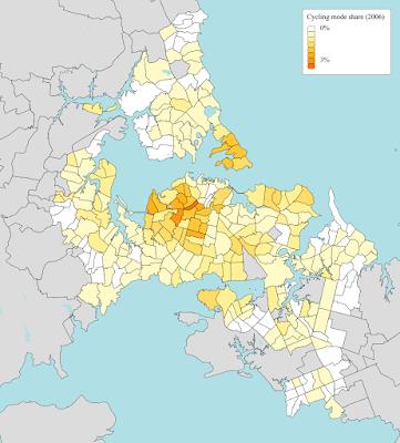
The maps below only show areas with at least 300 responses per km². First is 2001:
Even back then, two clusters of high cycling mode share—relatively speaking—are visible, one on the Devonport peninsula and one in the inner western suburbs.
Roughly the same pattern in 2006. There is quite some variance, which is to expected, cycle mode share is so low it is barely measurable within an area unit (in absolute terms we’re often talking about just a few dozen cyclists per area unit)

2013 shows a marked increase compared to 2006. A third cluster is starting to stand out, on the pacific coastline of the isthmus. *3
But why?
Two of those clusters are obviously correlated to cycling infrastructure. The first part of the northwestern cycleway was built in 2000, and work is ongoing to better connect this cycleway to the surrounding areas. The cycleway is quite popular among commuters. More recently cycling along Tamaki Drive has been slowly but steadily getting better.
I’m not sure about the Devonport peninsula. This area is quite badly congested (Lake Road, anyone?), and cycling to the ferry has been relatively popular over there. However it took until 2007 *4 for cycle lanes to be installed on Lake Road, which have been hotly contested ever since.
Deprivation
We can also approximately figure out which areas are ‘rich’. We will use the NZDep2013 Index, coming from Otago University *5.
No surprises here either. Rich areas are largely concentrated in coastal areas and in the inner ring of suburbs.
Cycling for the rich?
Looking back at those last two maps, it seems the areas with high cycling mode shares are indeed largely in rich areas. For example the little blob in the inner west almost exactly overlaps with an area of low deprivation. And Mission Bay. Devonport. Really?
This is especially clear on a scatter plot:
Big hole in the upper right there. To put it in neoliberal terms: if you want to cycle to work, don’t be poor. *6
Now what?
Step 1: if someone calls out bicycling as being a perk of the rich, stop being surprised by this. This is not a difficult thing to figure out.
Next year the data of the 2018 census will be released. Then I can repeat this exercise and see what changed.
The plan
The good news is that there is a 10 year plan for cycling investment *7. Even including some investment outside the usual hipster areas. On the other hand, many areas will be missing out entirely. And this is an entire decade.
At $600 million for 150 km of cycle lanes, it’s also seems… really expensive. Some say it involves not just the bikeways, but also wider upgrades to streets and town centres. But this means that we won’t cover that much area with the given budget.
The humble bike lane
There is something to be said for just plain simple bike lanes. While not considered state-of-the-art infrastructure, they are still a big improvement over the status-quo (which is more often than not weaving in and out between parked cars). The Netherlands and Denmark have their Copenhagen lanes now, but they too started out with more simple things.
Those lanes can (hopefully) be rolled out over a larger area more quickly. Then, as regular maintenance comes around, it will make sense to upgrade those lanes to something more substantial. Right now, that opportunity is wasted and roads are almost always just put back as they were.
Source: Stats NZ and licensed by Stats NZ for re-use under the Creative Commons Attribution 4.0 International licence.
Another thing visible on these maps is the creeping urban sprawl, especially around Flat Bush. Note also the development of Stonefields, which apart from poor access by PT seems to have very low cycling mode share.
There is a fourth cluster around Whenuapai, which is in the rural area just beyond Westgate and thus won’t show up on our map. This area also has a shorter average commute length than thesurrounding areas.
Bike Auckland has plenty of posts, see their Lake Road page. This is a strange area. By now it should be obvious that having everyone driving their cars is not going to work out over there. And yet, even the local board vehemently opposes anything which is not cars first.
June Atkinson, Clare Salmond, Peter Crampton (2014), “NZDep2013 Index of Deprivation”, Otago University
In absolute terms this is a very weak effect, mainly because there’s also a strong cluster of affluent area units with close to zero cycling. See also the quantiles of cycle mode share on the 10 point scale.
Also interesting: Talking Transport did a similar analysis from Christchurch and found no such bias over there.
PDF here, get it on the projects page from AT. There’s a pretty solid description of how areas were prioritized.


Post a Comment