The Wrong Side of my Car
The blog that wants to go obsolete
Census 2018 mode shares
With the travel data out for the census, we can now make our cycling modeshare GIF. Purely for posterity — the COVID-19 crisis has made all of this pretty much obsolete.
The 2018 map looks completely different from the previous 2. Cycling is way more concentrated in the “bike-friendly” suburbs. I have no idea why that is, maybe the counting was different. None of those areas are places where you’d consider buying a place to live even with an income in the lower six figures. *1
The impact of the northwestern and Tamaki Drive cycleways clearly stands out. The Devonport peninsula still doesn’t have that flashy infrastructure, but it is unusually shitty for driving to work.
What about the Future Streets programme in Māngere? Nothing. That is bad news for people who argue cycling is not a thing for the rich.
The level 1 data gives a more detailed, but in this case very noisy view. Cycling mode share is barely detectable at this level. So the GIF above uses the larger area units *2.
What about the others?
A nice looking compact blob in the middle. A striking illustration of the difference between ‘human scaled’ and ‘modern city’ scaled.
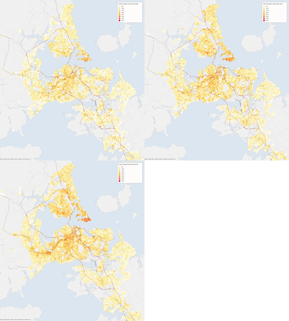
Next: public transport:
Clearly growing, at least until a few weeks ago.
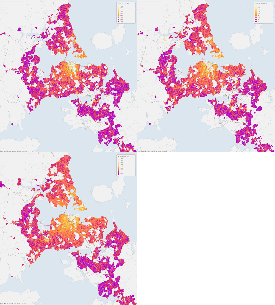
Finally: car. This is the undisputed king, the highest bin (in purple) on this map is 90% — ninety percent — and it still covers a lot of area.
Auckland is the city of cars, but a bit less than last census. Even the car strongholds like Westgate and South-east Auckland have slightly dropped. The exception is South Auckland, giving some credibility to the idea that cars are becoming the vehicle of the poor.
Now, why can’t people just work from home in this day and age?
That slightly increased, but one could still call it stubbornly low. But this is perhaps the most obsolete map of them all.
Of course that was then, in 2018, back in the time when SARS and similar coronaviruses were still a far-from-my-bed show. A global pandemic of this scale was a thing of the past…
until it wasn’t.
And now. There is an unforeseen, but very prominent effect on the street. The endless roar of traffic has mostly disappeared. Many people are now experiencing something that was inconceivable just a few weeks ago.
Streets as positive space.
You can walk and actually hear birds. You can talk without having to yell over the car noise. You can hear other people talking. You can walk with your kids without fearing for their lives. For many people here, this is the first time in their lives they experience this in their neighbourhood instead of some far away designated hipster playground. How happy will everyone be to go back to car-only streets?
Even in the city after COVID-19, these maps above may be obsolete.
The December hindsight note
The answer to that question turned out to be ‘reasonably happy’, and Auckland stands out even among its Anglo peers as being exceptionally resistant against change in this direction. Even during the lockdowns we got but a token gesture of a dozen or so kilometres of bicycle tracks, which were mostly dismantled as soon as the lockdown ended.
I.e. a yearly income of over $100,000. This is already well over the median household income. The days when a 6 figure job would get you a home in a ‘good’ area are gone.
That is now called ‘Statistical area 2’. The former meshblocks have generally been fused toghether to slightly larger ‘Statistical area 1’ units.
The 2006 and 2013 censuses didn’t have a "ferry" answer. Apart from Devonport, "other" was never a popular answer so I added this to Public Transport for these years.
These maps are based on the proportions fields in the census, eg
Census_2013_Travel_to_work_by_usual_residence_address_Proportions_worked_today_009_Bicycle_CURP_employed_15years_and_over
Cycling:
- 9 — Bicycle
Walking:
- 10 — Walk or jog
Public transport:
- 6 — Public bus
- 7 — Train
- 12 — Ferry (2018)
- 16 — Other (2006 and 2013, since "ferry" was not a possible answer back then)
From home:
- 1 — Work at home
Car:
- 3 — Drive a private car truck or van
- 4 — Drive a company car truck or van
- 5 — Passenger in a car truck van or company bus
Areas with reported population density below 600/km² are not coloured to avoid large blobs representing only a few people.
The base layer comes from data provided by Auckland Council for the 2014 hackaton (the streets), and from LINZ topographic data (the landscape and railways). It was rendered using Mapnik. Excuse the missing Waterview tunnel, but it should still be close enough to have a feel of where those blobs and patches are.
The boundaries for the statistical areas and the numbers come from Stats NZ.
As far as I understand all this data is released under the Creative Commons Attribution New Zealand license, so these maps inherit that license.
I’ve put up a version of these maps on Observable: @roelandschoukens/mode-share-map. Setting up that map took about 0.1% of the time it took to get Python to render data loaded with Geopandas.


Nice work, I've always been a bit hopeless at extracting data from the census. I'm a member of the city centre residents group so always interested in all stats city centre-focussed, especially anything which underlines how we embrace non-car options abd their importance over cars. Is there any data on car ownership for the city centre?
ReplyDeleteIf you are ok I would like to put some of these pics up on our website with attribution, or link to this page or site or whatever might work for you.
Thanks
Adam
Hi Adam,
ReplyDeleteSorry for the late reply. Yes you can put these images up on your website. As far as I know all the source data is provided under a Creative Commons Attribution license.